Floor Planning for an Old American Foursquare
At this point, we've had the chance to really evaluate our options and get some detailed measurements. We'd like to jump right in refinishing the wood floors (almost all are in top-knotch condish!) BUT we first have to figure out what to do with the walls.
Now, if you have browsed our house tour, you may have noticed a strange wall. I know I did.
While not overtly awkward, it definitely left me going "hmmm...." and on further inspection, you may think, "oh hey I've seen another wall like that!" and if you did think that, you were right. The master bath is hanging out on the other side!
While this isn't a terrible arrangement, I dream of a master bath with some natural light, and while this bathroom is large in size, it's not an ideal shape. Thus, we begin to rethink how the first floor in configured.
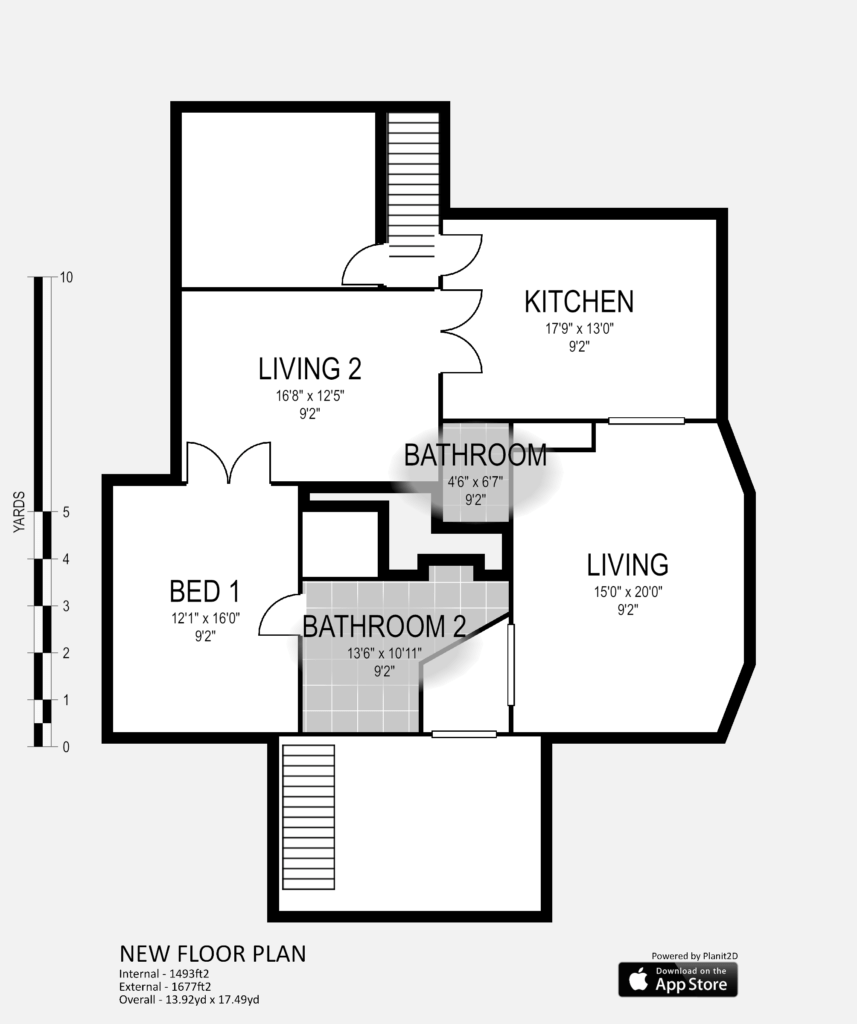
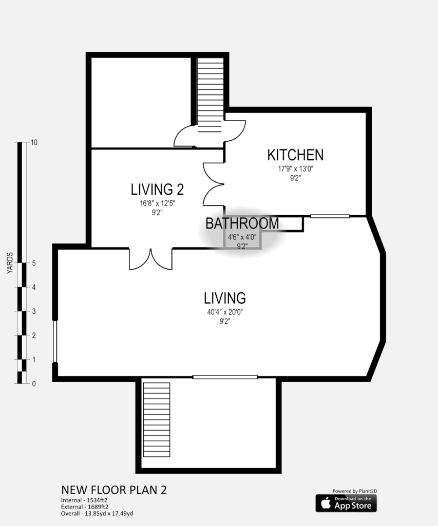
Let's start by looking at it's present layout.
Two things to note here. 1. The bedroom is a bit on the small side. Not that we need a monster, but as it is currently, our bed would be right at the front of the house, not allowing for much in the way of privacy. 2. The Living 2 room, which currently serves as a dining room, isn't the most functional for us. We're more of the eat-in-front-of-the-tv people and the kitchen is big enough for any adult-table-sitting we might need.
So as I started rethinking the layout, I found it easiest to conjure up visions of what it might have looked like originally. Cue desperate searches on the internet!
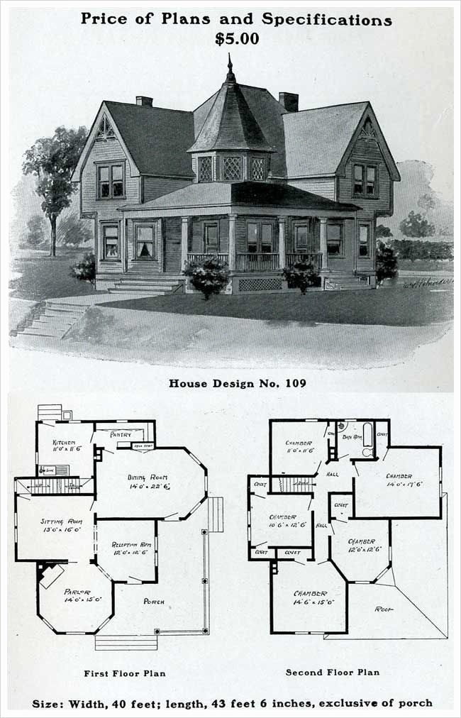
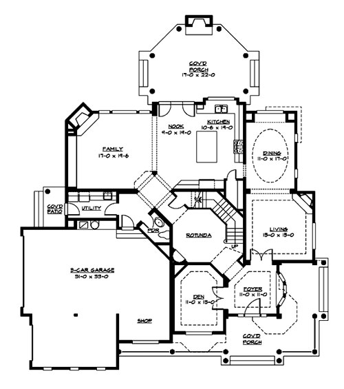
When I first started searching, I thought I was looking for Victorian floor-plans.

My house is not Victorian.
Look at all those rooms! Circles! Squares! Rectangles! Nooks! Crannies! Our house has NONE of those classic Victorian rooms or hallways.
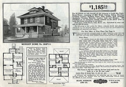
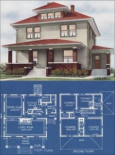
Our layout, upon much deeper research, is instead more reminiscent of an American Foursquare. Foursquare homes kicked off in the early 1900s and were the first of mail-order homes. Unlike the small rooms and winding pathways of the Victorian era, the Foursqaure layout was all about maximizing space. Typically, the floor plan had a room at each square. Very few nooks and crannies, lots and lots of space.
Even better, because these houses were in Sears catalogs, I was able to track down some original floor plans.
That looks more like our house, doesn't it? And this floor plan is what really got my noggin' cookin'.
(Sorry it's a little fuzzy!)
With this inspo, I landed on this following layout being my best guess.
Well, hello there, big open living room! I sent this over to my mother-in-law/consultant/previous-visitor-of-this-house to confirm this is closer to the original layout. We're still missing the locations of the two fireplaces, but it's close enough to rebuild the floorplan from scratch.
The first thing I wanted to do was move the bedroom into the dining room. (labeled Living 2). We don't need one, and if we can swap out the french doors for a single door, we'll have enough privacy even while being right off the kitchen.
The second thing I wanted was a master bath with a large closet. And if you have a keen eye, you might notice some vacant space to the left of the maid stairs. (we have a maid stair, but I've yet to find the maid). Presently, it's more of a workshop room, with some beat up wood floors and paneled walls. Which means it's an excellent candidate to be a master bath and closet!
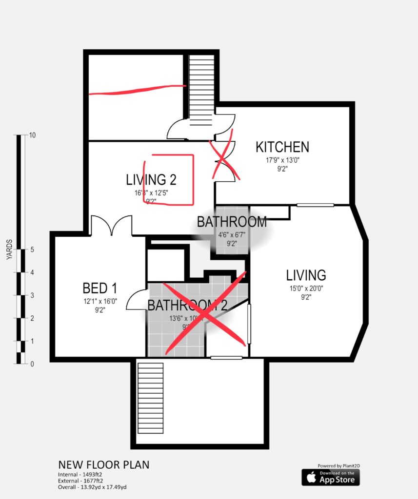
The third thing was maximizing the space left after we moved the bathroom. This was a real puzzler. I never want to open up space "just because," I need a plan for its future function.
Enter: "The Study." We imagine what was the bedroom will become a sitting room/office combo for Cole and I. As we have more guests come stay with us, we'll want some space we can easily close off for ourselves.
Fourth consideration was the current half-bath. The toilet is currently tucked behind the washer/dryer, which is a little funky when you're sending guests to the bathroom. "Take a right at the washer."
Instead, I'm toying with the idea of moving the toilet out and creating a new half-bath towards the front of the house, making it easier to access in a pinch. And we lessen the chance of poop stink the kitchen. I'm just being realistic.
And here's where I've landed thus far!
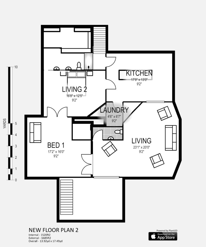
Ok, I did a terrible job labeling these rooms, but I have a suspicion you can figure it out. In terms of tearing walls out, we'll be removing all the walls currently in place around the master bath, as well as part of the living room wall, and we'll be cutting into the back of the previous dining room to create an entryway to the new master bath.
We'll be closing off the door at the base of the maid stair to make room for a shower, and we'll relocate the french doors previously attaching the kitchen to the dining room, to the front entry. We'll put in some new drywall to build out our new walk-in closet where Cole will keep all his boots.
The two angular lines are where I envision working in new electric or gas fireplaces. One to create a focal point in the living room, the other to cozy up the bedroom.
Wheew, that was exhausting to explain. I'd love your thoughts or ideas how to even better maximize the space, because tbh, I'm super nervous to be tasked with such a job.
Till next time!
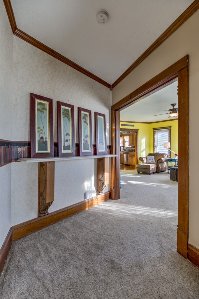
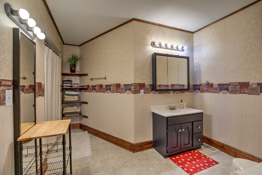
You 100% got this!! I love hearing your thought process and intentionality behind considering the original layout and history. 🙂
I hope you will be able to repurpose those amazing corbels from the current foyer. And I love the big chunky trim around the doors. Do you think all that horrible wallpaper/borders are from the early 90s? Those weren't the best of times for wallpaper...